How to Speak Designer: Part 1 – Typography
Published January 21st, 2021 by Foxhaus Creative
Written & illustrated by Micah Kearns
Typography Basics
 Before computers came around, arranging text for print used to be a specialized skill done by typesetters by setting wood or metal type into a tray to be used in a printing press. From the 1960's through the 90's typesetting was done using x-acto knives, transparency paper, and photography equipment. Nowadays, computers make the process far less messy, but the same skills are still needed to make the final text look as good as possible for print.
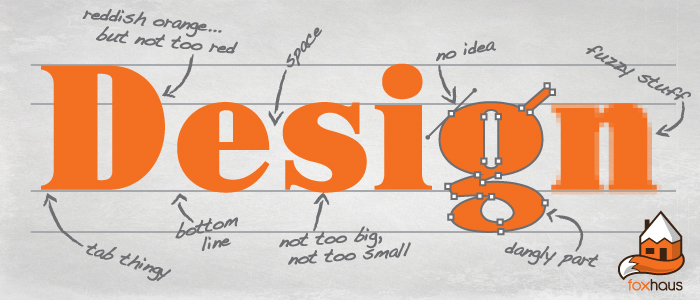
Good typography reinforces the meaning of the text, so it's primary goal is not to look good, but to communicate its message as effectively as possible. Getting text to both look good and communicate clearly is the challenge of a good graphic designer, and is not a purely subjective art. Bad typography might not get noticed in a college paper or office memo, but when your company is investing money in reaching as many potential customers as possible, it becomes important to make the message stand out. This glossary will help you understand the changes your designer is making, and why they are making them.
Now that everyone and their mother uses Microsoft Word, many of the basic concepts are widely known. I won't get into the definitions for font, italic, column, margin, line space, or anything else that your average 5th grader would know after typing up a book report. We'll be looking at some more meaty typographic vocabulary, such as: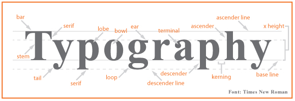 Ok, as a non-designer you really don't need to know many of the above terms. Interesting, perhaps; good for trivia, sure; but past that, there's only a few that are commonly used when discussing a design. The following vocabulary should get you by in most situations.
Point Size - Font sizes are measured in points. An individual point is 1/72 of an inch tall, so one would assume that a 12-point font is 1/6" tall. Alas, this is not always true, as actual size is often arbitrarily set by the font's designer. The cutoff for legibility for print fonts seems to be about 6-8 points, and for web is around 9 points.
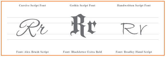
Script - Script fonts are based on different handwriting styles, and can be connected and elegant like cursive fonts such as Old Script, bold and elaborate like gothic fonts such as Blackletter, or childishly casual like the much-hated Comic Sans.
Ok, as a non-designer you really don't need to know many of the above terms. Interesting, perhaps; good for trivia, sure; but past that, there's only a few that are commonly used when discussing a design. The following vocabulary should get you by in most situations.
Point Size - Font sizes are measured in points. An individual point is 1/72 of an inch tall, so one would assume that a 12-point font is 1/6" tall. Alas, this is not always true, as actual size is often arbitrarily set by the font's designer. The cutoff for legibility for print fonts seems to be about 6-8 points, and for web is around 9 points.
Script - Script fonts are based on different handwriting styles, and can be connected and elegant like cursive fonts such as Old Script, bold and elaborate like gothic fonts such as Blackletter, or childishly casual like the much-hated Comic Sans.
 Serif - These are the small lines or tabs attached to the ends of a letter stroke in certain fonts such as Baskerville, Garamond, or Times New Roman. Traditional serif fonts are business like or old-fashioned looking, and the serifs are said to increase legibility by creating a flow from one letter to the next. They are used widely for print applications, especially book text.
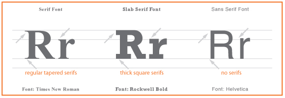 Slab Serif - If the serif is the same thickness as the rest of the letter, it's called a slab serif. Some examples of slab serif fonts are Courier, Rockwell, or typewriter fonts. Some slab serif fonts have such heavy serifs that they look 'western', such as the Playbill or Regulator fonts. If you're designing a 'Wanted' poster, you'll want to use these.
Sans Serif - Sans is French for 'without', so a sans serif font doesn't have them. Some common examples or sans serif fonts are Arial, Helvetica, and Optima. Sans serif fonts are clean, modern and minimalistic looking. They are used widely online, and modern print applications such as magazines and advertisements.
Kerning - Kerning is the space between two letters in a word. This space can be adjusted to make the letters 'fit' together in a visually pleasing way, and reduce extra space between letter combinations such as AV, LY and TJ that look better when nested closer together.
Tracking - Tracking is when you increase the spacing between all the letters on a line. Increasing the tracking can sometimes make a small font more legible, or give an interesting effect to a header or title.
Slab Serif - If the serif is the same thickness as the rest of the letter, it's called a slab serif. Some examples of slab serif fonts are Courier, Rockwell, or typewriter fonts. Some slab serif fonts have such heavy serifs that they look 'western', such as the Playbill or Regulator fonts. If you're designing a 'Wanted' poster, you'll want to use these.
Sans Serif - Sans is French for 'without', so a sans serif font doesn't have them. Some common examples or sans serif fonts are Arial, Helvetica, and Optima. Sans serif fonts are clean, modern and minimalistic looking. They are used widely online, and modern print applications such as magazines and advertisements.
Kerning - Kerning is the space between two letters in a word. This space can be adjusted to make the letters 'fit' together in a visually pleasing way, and reduce extra space between letter combinations such as AV, LY and TJ that look better when nested closer together.
Tracking - Tracking is when you increase the spacing between all the letters on a line. Increasing the tracking can sometimes make a small font more legible, or give an interesting effect to a header or title.
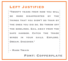 Justification - A paragraph is called 'justified' when the lines of text touch both margins on each side. The last line of the paragraph can be aligned to the left, center, or right. Justified text can look very geometric and well organized, and is used widely in magazine and newspaper columns. The space between words and letters is stretched or compressed to allow each line to touch both margins, and this can negatively affect legibility. When used in narrow columns this can sometimes cause very large white spaces between words which is unattractive and hard to read. These white spaces can be reduced by increasing the tracking of that particular line.
Drop Cap - Sometimes the first letter of a paragraph is made larger and 'drops' down to take up multiple lines. These drop caps are used to make the beginning of a new section more obvious. Sometimes these get ridiculously ornate, such as in antique manuscripts in the 8th-century British Isles, possibly as relief from boredom for the monks that were transcribing all that text by hand.
Well, there you have it. Going into your next design consultation armed with these tidbits of knowledge will help you communicate your vision more effectively with your client. And the more you understand, the more efficient the design process will be, which means lower cost and better results for you. I hope this tutorial helps!
Justification - A paragraph is called 'justified' when the lines of text touch both margins on each side. The last line of the paragraph can be aligned to the left, center, or right. Justified text can look very geometric and well organized, and is used widely in magazine and newspaper columns. The space between words and letters is stretched or compressed to allow each line to touch both margins, and this can negatively affect legibility. When used in narrow columns this can sometimes cause very large white spaces between words which is unattractive and hard to read. These white spaces can be reduced by increasing the tracking of that particular line.
Drop Cap - Sometimes the first letter of a paragraph is made larger and 'drops' down to take up multiple lines. These drop caps are used to make the beginning of a new section more obvious. Sometimes these get ridiculously ornate, such as in antique manuscripts in the 8th-century British Isles, possibly as relief from boredom for the monks that were transcribing all that text by hand.
Well, there you have it. Going into your next design consultation armed with these tidbits of knowledge will help you communicate your vision more effectively with your client. And the more you understand, the more efficient the design process will be, which means lower cost and better results for you. I hope this tutorial helps!